EPA air data
Virginia Iglesias, ESIIL Data Scientist 2023-05-21
The United States Environmental Protection Agency (EPA) is at the forefront of monitoring and protecting the country’s environment, and one of its critical areas of focus is air quality. As part of its efforts, the EPA has developed a comprehensive dataset that contains detailed information on air quality across the counties in the United States.
This dataset provides an in-depth look at various air quality metrics at the county level, making it a rich source of information for researchers, policymakers, and environmentalists. The dataset includes data on pollutants such as particulate matter (PM2.5 and PM10), nitrogen dioxide, sulfur dioxide, carbon monoxide, and ozone, among others. These pollutants are key indicators of air quality and have direct implications for human health and environmental wellbeing.
But the EPA’s data offerings don’t stop with this dataset. Several related datasets are readily available on the EPA’s Air Quality System (AQS) site, which you can find here. These additional resources provide further granularity and different perspectives on air quality, including data on the Air Quality Index (AQI), daily summaries, annual summaries, and more.
These datasets offer a comprehensive suite of information for anyone interested in understanding the state of air quality in the United States. Whether for academic research, environmental policy development, public health studies, or personal interest, the EPA’s air quality datasets provide valuable insights into the state of the nation’s air and the challenges we face in keeping it clean.
In R, we need 2 packages to download and visualize the data. First, check if the packages are already installed. Install them if they are not:
packages <- c("tidyverse", "httr")
new.packages <- packages[!(packages %in% installed.packages()[,"Package"])]
if(length(new.packages)>0) install.packages(new.packages)
Then, load them:
lapply(packages, library, character.only = TRUE)
Download the data set:
url <- "https://aqs.epa.gov/aqsweb/airdata/annual_aqi_by_county_2022.zip"
aqi <- GET(url)
data_file <-"aqi.zip"
writeBin(content(aqi, "raw"), data_file)

# Unzip the file
unzip(data_file)
Read the data set:
aqi <- read_csv('annual_aqi_by_county_2022.csv')
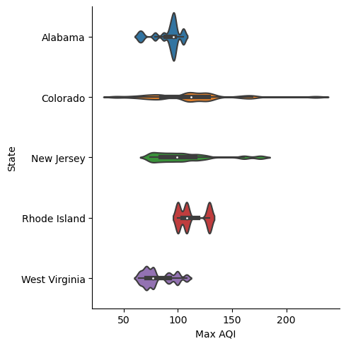
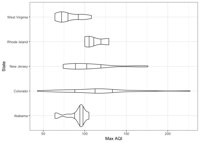
Select 5 states and make violin plots of the maximum air quality index per county in 2022:
aqi_5_states <- aqi %>%
  filter(State %in% c("Alabama", "Colorado", "New Jersey", "Rhode Island", "West Virginia"))

ggplot(aqi_5_states) +
  geom_violin(aes(x = `Max AQI`, y = State), draw_quantiles = c(.25, .5, .75)) +
  theme_bw() +
  ylab("State")
In Python, we need 5 libraries to download and visualize the data.
import requests
import zipfile
import pandas as pd
import seaborn as sns
import matplotlib.pyplot as plt
Download the data set:
url = "https://aqs.epa.gov/aqsweb/airdata/annual_aqi_by_county_2022.zip"
aqi = requests.get(url)
data_file = "aqi.zip"
with open(data_file, 'wb') as f:
    f.write(aqi.content)
    data_file = "aqi.zip"

# Unzip the file
with zipfile.ZipFile(data_file, 'r') as zip_ref:
    zip_ref.extractall()
Read it:
csv_file = "annual_aqi_by_county_2022.csv"
aqi = pd.read_csv(csv_file)
Select 5 states and make violin plots of the maximum air quality index per county in 2022:
states = ["Alabama", "Colorado", "New Jersey", "Rhode Island", "West Virginia"]
aqi_5_states = aqi[aqi['State'].isin(states)]

plt.figure()
sns.catplot(data=aqi_5_states, x='Max AQI', y='State', kind='violin', bw=.15)