How to use this page during the Summit
- This page is your team’s shared workspace and final report-out page. It captures your group’s process and thinking throughout the Summit and will be used to share your work with others.
bea testing to see who sees this. sorry if this shows up for everyone.
- Use this page as your team’s working record during the Summit and your final report-out.

- The Summit has several different goals and thus you will use the page differently each day: Day 1 is for alignment, Day 2 is for building one useful thing, and Day 3 is for synthesis and report- out.

- Look for the green buttons to indicate what you need to edit.

- Megaphones 📣 indicate which items you will be presenting during the end-of-day report-outs.

- Only the items with megaphones will be visible when you hit the 'Summit Report Out' button.

- If you turn off 'Instructions' then you will only see the page content for public display.
Team 1 Home: Make Me Your Own
For ESIIL staff
Group Number: 1
Breakout Room #: (To be assigned by ESIIL Staff)
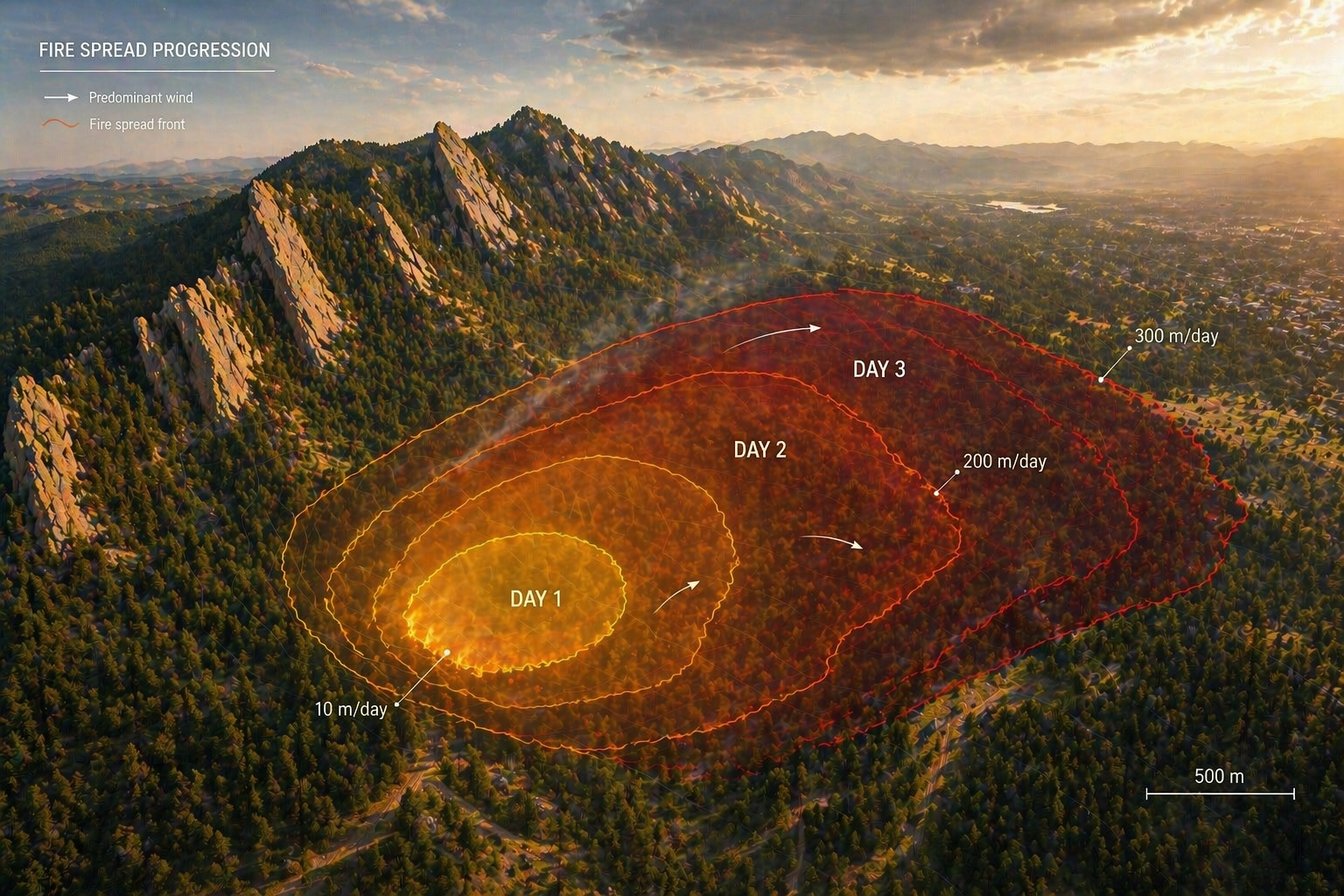
How to replace the image above
Upload an image that represents your project and welcome people to your page.
Upload your own image to docs/assets/hero/ and replace the file named hero.png. Use a wide image if you can, then refresh the site preview to check how it looks.
Keep the file path docs/assets/hero/hero.png if you want the Markdown above to keep working.
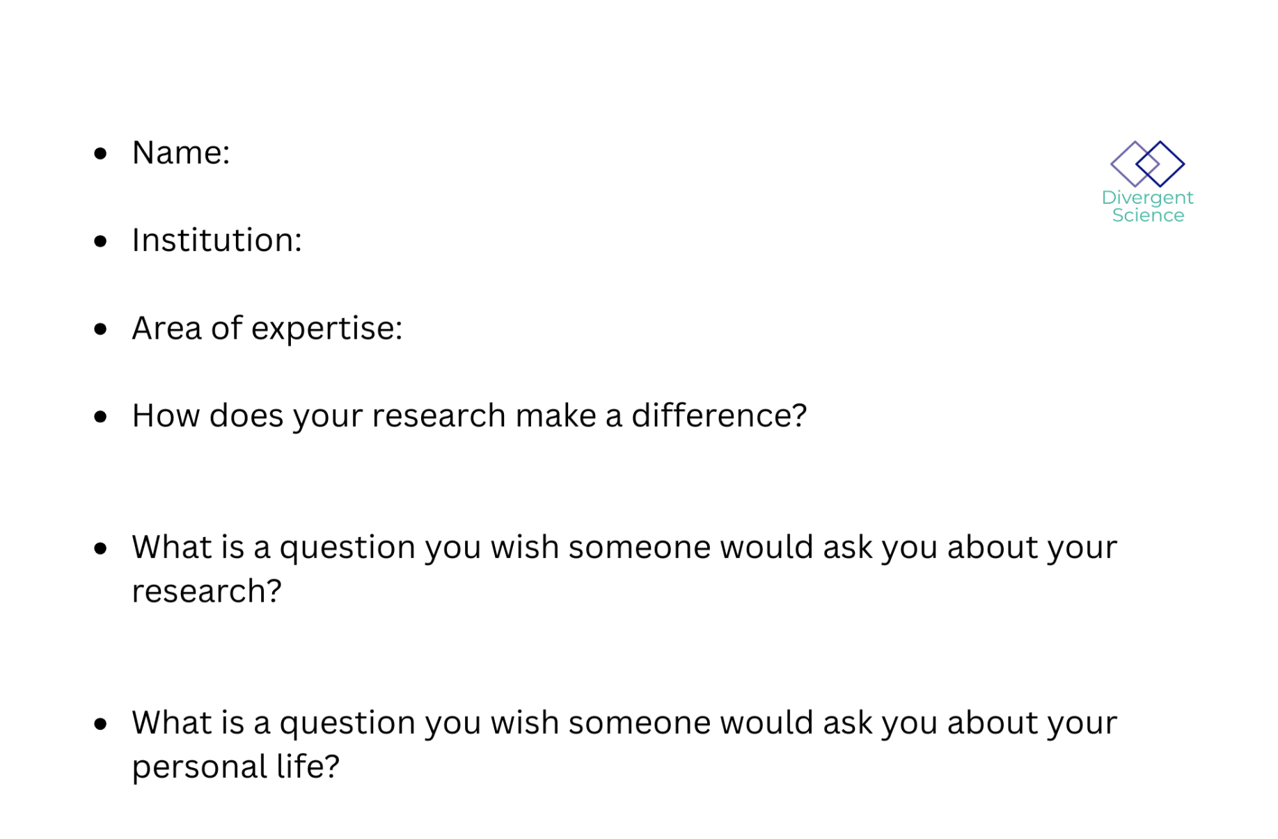
People
Day 1 task
Get to know your team: share your cards (5-7 mins). Update your team roster (2-3 min).
Use the in-person name cards to guide quick introductions.
| Name card prompts | Follow-up notes |
|---|---|
 |
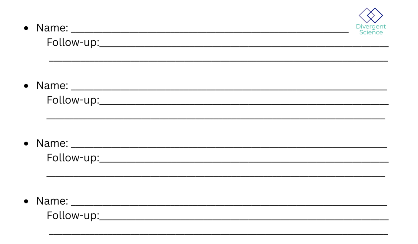 |
| Name | Affiliation | Contact | Github |
|---|---|---|---|
Team Norms and Decision Making
Day 1 task
Suggested Self-Facilitation Instructions:
-
Round Robin: Everyone shares 1 norm that they think will be important for their team during the Summit and perhaps following the Summit (2 min).
-
After everyone has shared, make a list with as many norms as possible in GitHub (5–7 min).
-
Vote on your top 3 ideas. (Each person gets 3 votes; you can use all your votes on 1 idea or spread them out) (2 min).
-
In GitHub, move all team norms with votes to the top of the list.
| Gradients of agreement |
|---|
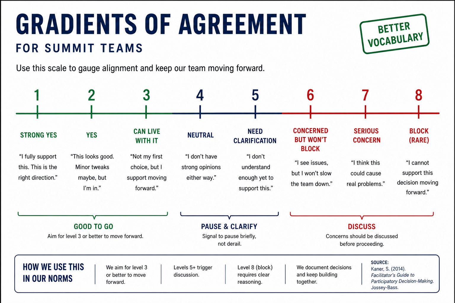 |
Our team norms:
- ...
- ...
- ...
Our decision making strategy:
...
Our product(s) 📣
Day 2 Tasks
Morning Focus: questions, hypotheses, context; add at least one visual (photo of whiteboard/notes)
Afternoon Focus: try a few datasets and analyses. Keep it visual, keep it simple. Update the site to reflect what you test.
Short term:
...
Long term:
- ...
- ...

Morning whiteboard or notes showing the question, hypotheses, and context we used to start Day 2.
Our question(s) 📣
Our working question:
...
What would count as progress:
...
Hypotheses/Intentions [Optional: probably not relevant if you are creating an educational tool]
Why this matters (the “upshot”) 📣
This matters because:
...
People who could use this:
...
Data sources we’re exploring 📣
data exploration
Provide a snapshot showing some initial data patterns.
Add 2-4 promising data sources (links +1-line notes)
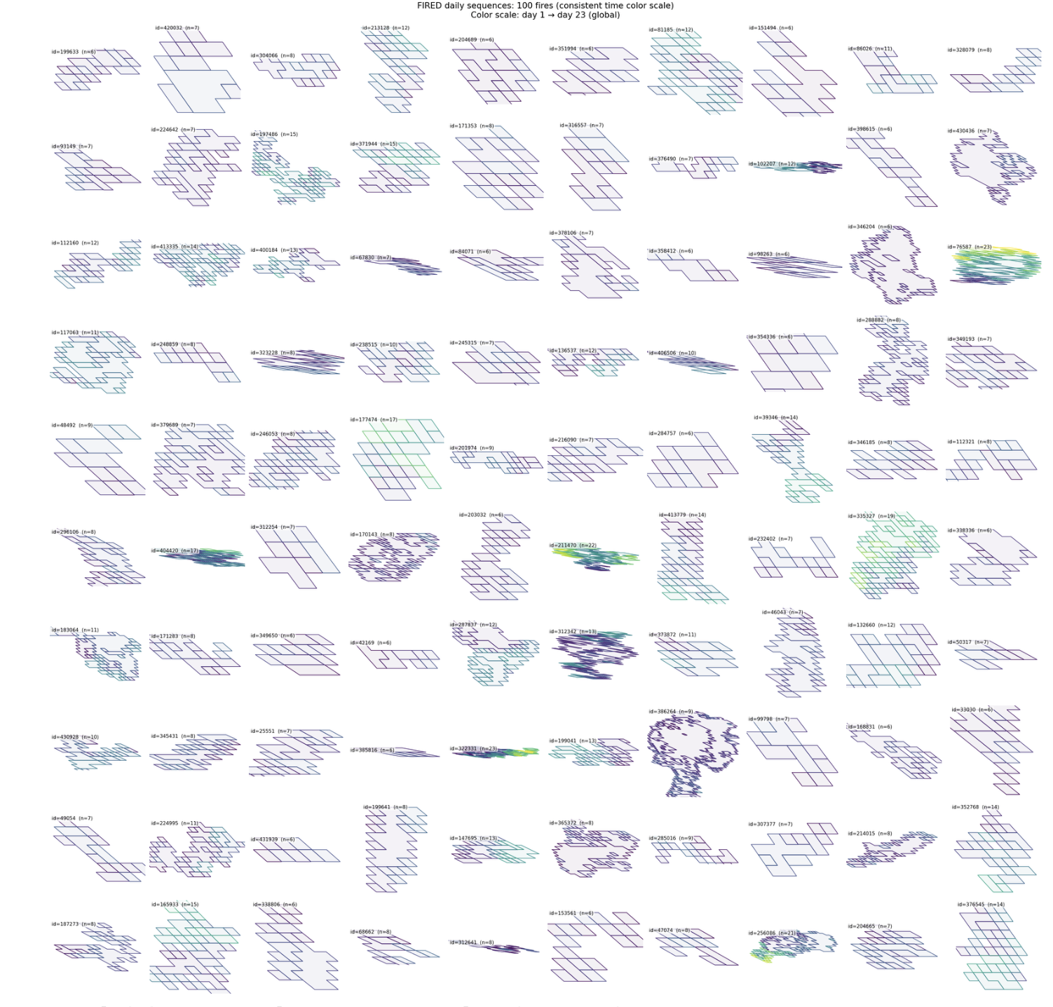
Snapshot showing initial data patterns.
Promising data sources:
- Data source 1: ...
- Data source 2: ...
- Data source 3: ...
- Data source 4: ...
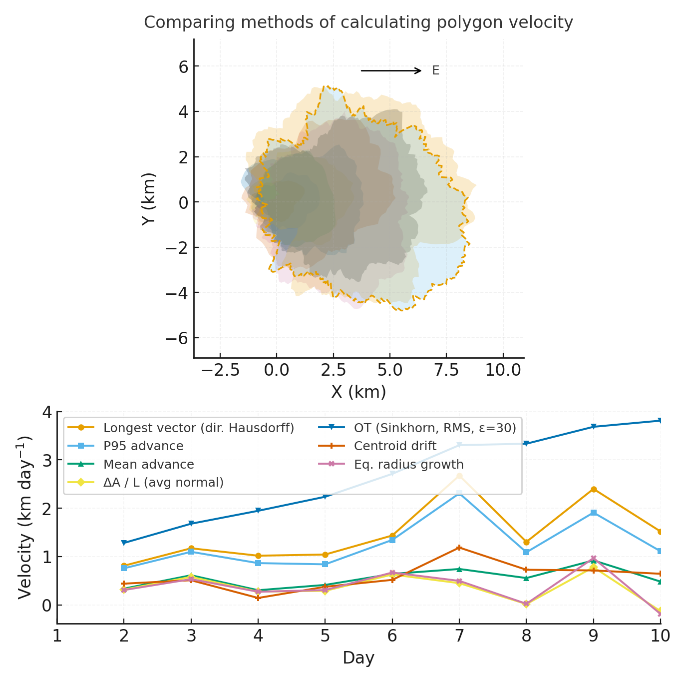
Methods/technologies we’re testing 📣
methods
Add 2-4 methods/technologies we're testing (stats, models, viz).
Methods/technologies we are testing:
| Method or technology | What we tested | Early note |
|---|---|---|
| ... | ... | ... |
| ... | ... | ... |
| ... | ... | ... |
| ... | ... | ... |
Challenges identified
- ...
- ...
Visuals
Next Steps
Short term:
Long term:
Day 3 Tasks
Sythesis: highlight 2-3 visuals that tell the story; keep text crisp. Practice a 6-minute walkthrough of the homepage. Why -> Questions -> Data/Methods -> Findings -> Next
Team Photo
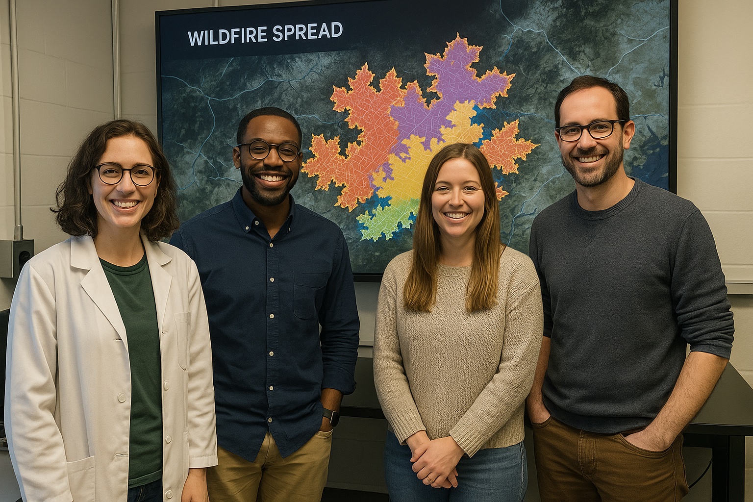
Team members and collaborators who contributed to this project.
Findings at a glance 📣
Headline 1 — what, where, how much
...
Headline 2 — change/trend/contrast
...
Headline 3 — implication for practice or policy
...
Visuals that tell a story 📣
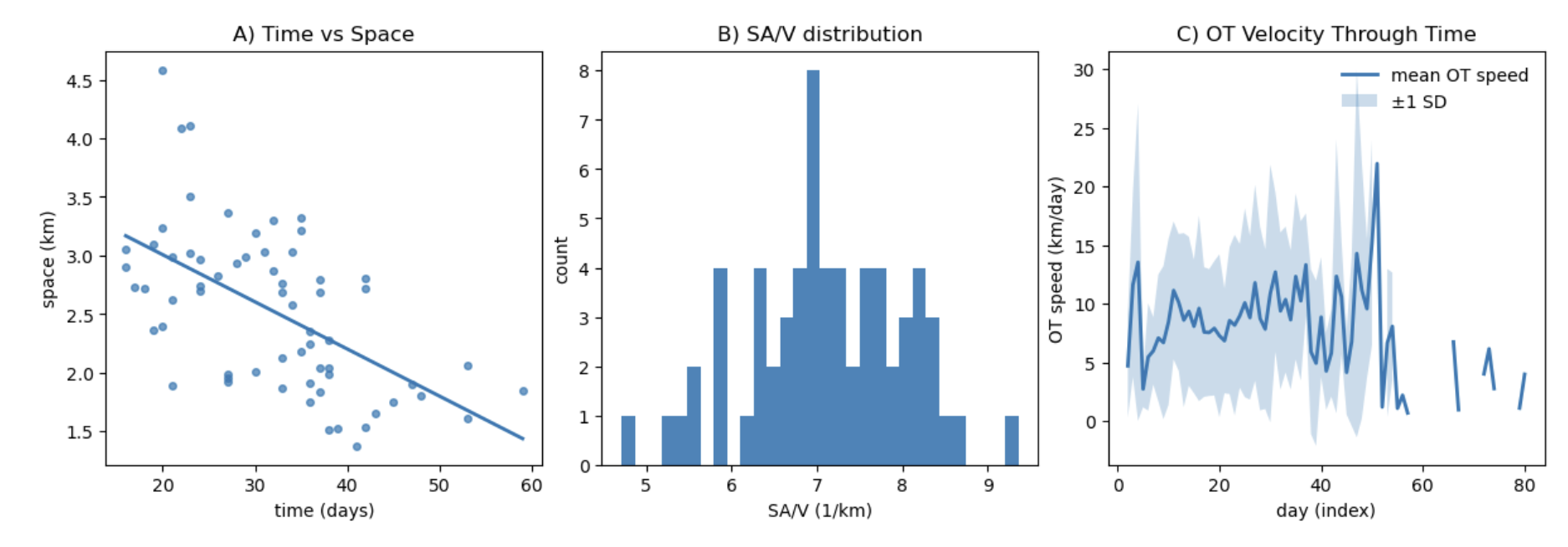
Visual 1: the main pattern or output we want people to remember.
What’s next? 📣
Short term:
- ...
Long term:
- ...
Who should see this next
- ...
Cite & Reuse
If you use these materials, please cite:
Summit Team. (2026). Project Group OASIS — Innovation Summit 2026. https://github.com/CU-ESIIL/Project_group_OASIS
License: CC-BY-4.0 unless noted.